TBI wanted their online account area to feel premium, and reflect the status of their high wealth clients. With only a logo currently defining their visual identity, the direction for this project was very much up for grabs.
I worked with an Art director on this project from concept right through to final delivery.
Through a workshop with TBI we were able to better understand their aspirations for the UI. Together we analysed their competitors and defined the digital space in the market that they wanted to be in. Here we decided on two visual routes to explore.
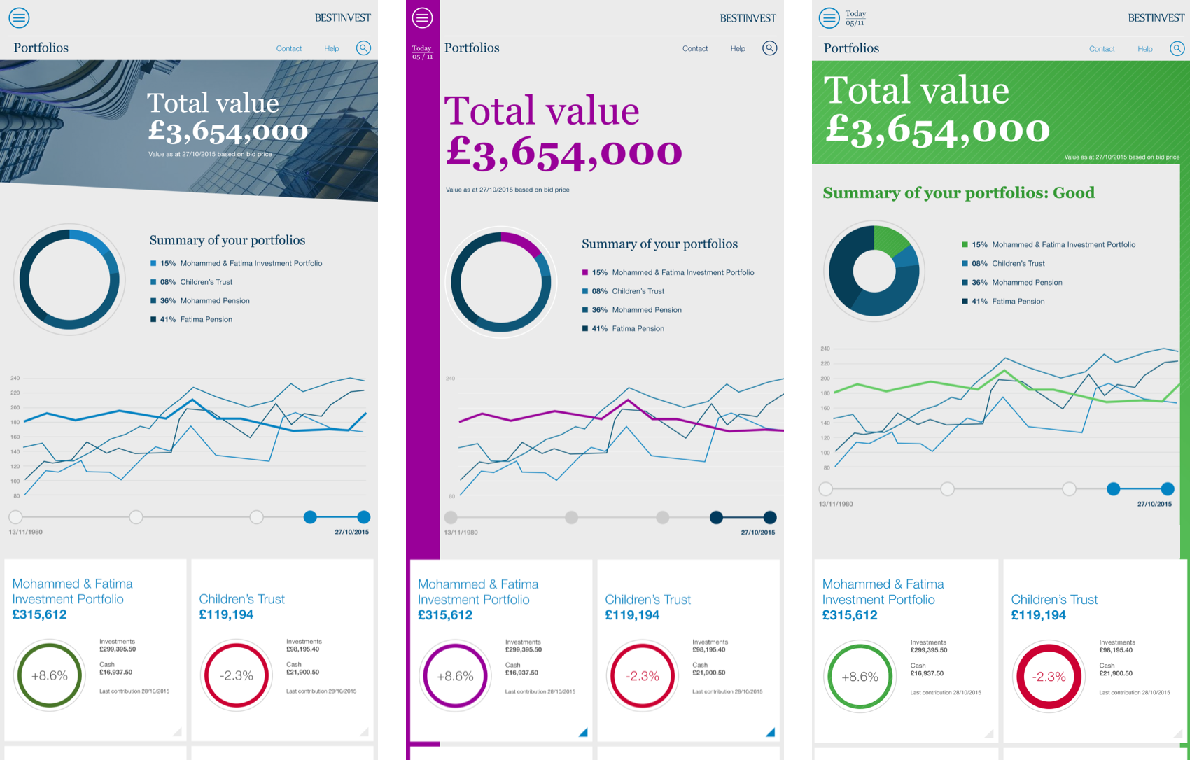
This concept reflected TBI's detailed reporting style. It would surface very detailed content, but within a single digestible format. It would feel editorial in style, and use colour as signifiers of the health of the investment accounts.
A positive to this concept was that it was already familiar to TBI's audience and the investment sector. But a negative was that the complex arrangements of data would be difficult to implement in a consistent way across a responsive experience - for example at mobile.

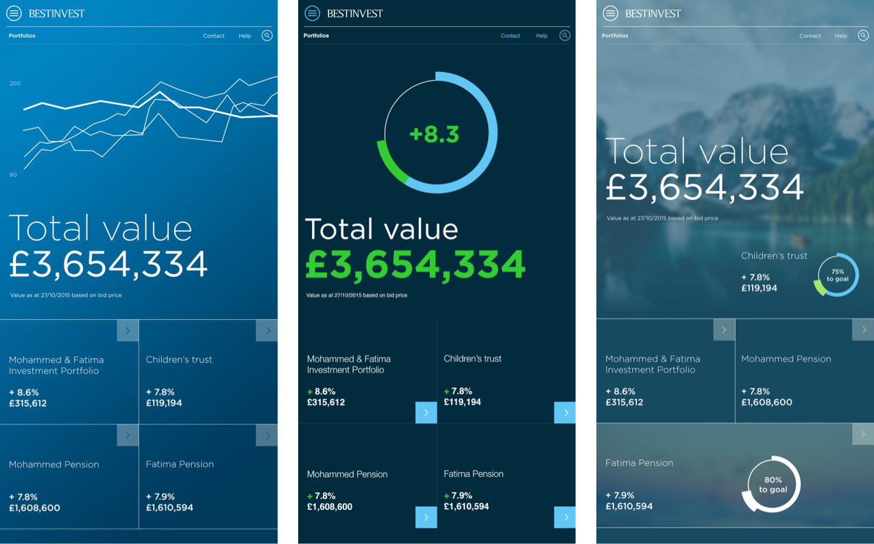
A more contemporary design approach, this concept used large typography and high level graphical representations to summarise and prioritises critical account information.
The positive of this route was that the simple uncluttered arrangements of information are easier to implement across a responsive experience. Also, a singular focus would allow for direct and clear messaging, creating a personal connection between TBI and its growing audience. However, a negative aspect of this concept was that customers had to navigate further to find the detail they had been accustomed to receiving from TBI.

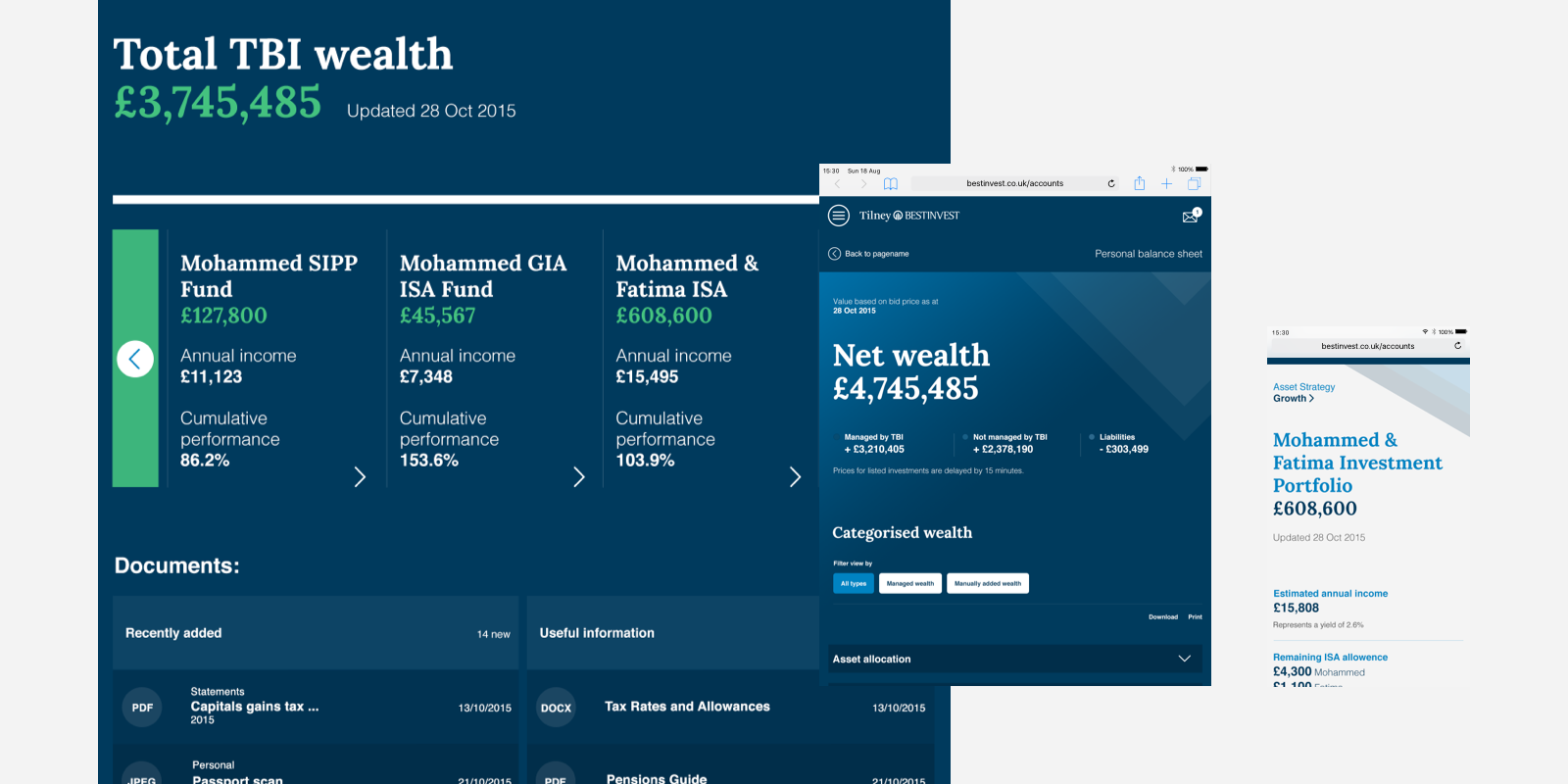
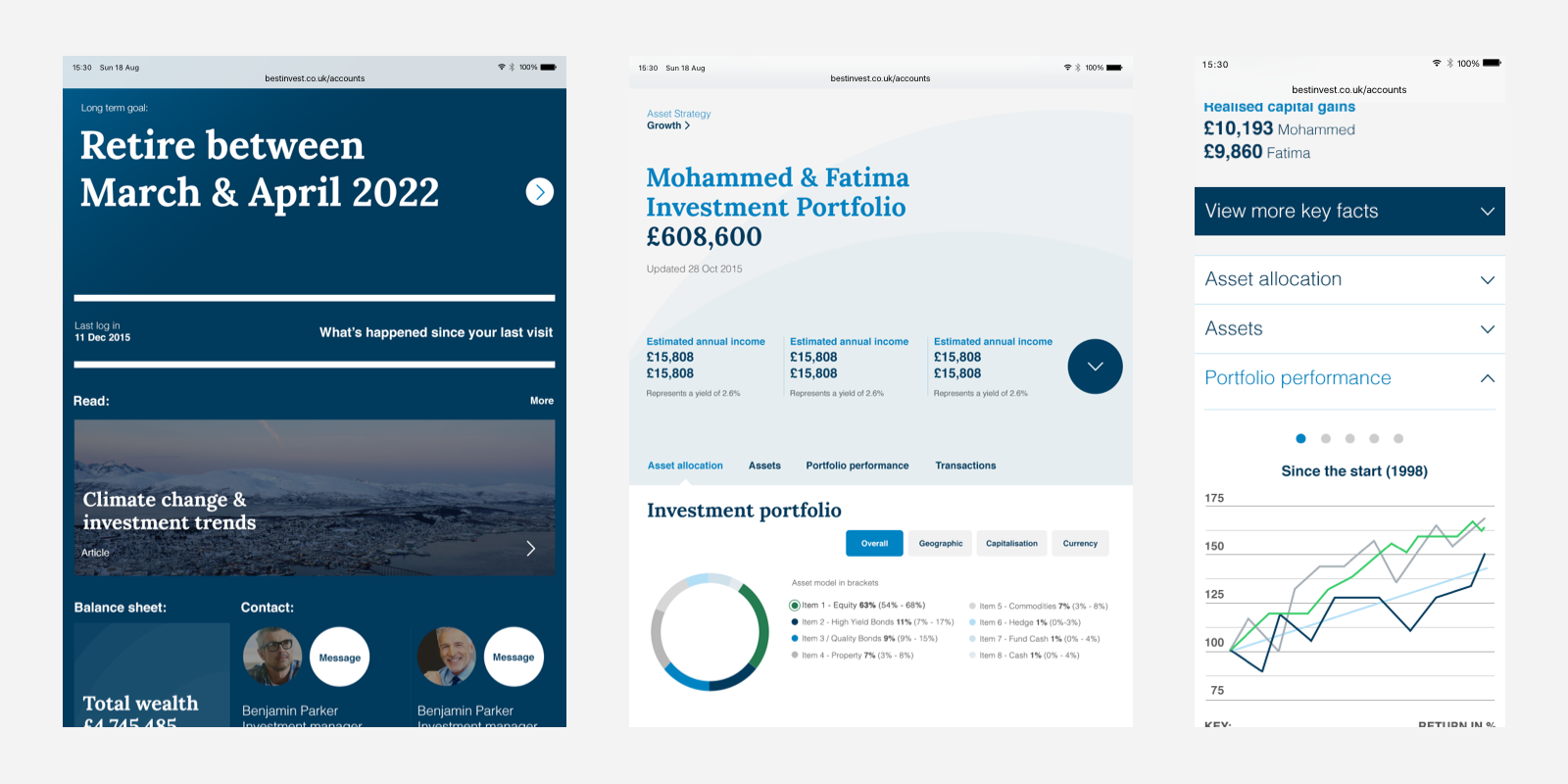
A mixture of the two concepts were combined and explored further. TBI wanted to pursue the 'less is more' simplified direction of route two, but incorporate a serif typeface and use of colour as a signifier from route one, which was familiar to their clients from their current reporting style.
To bring some life and personality to the simplified UI we introduced an ambient background motif which could use movement, changing in colour and shape, to depict the health of the accounts. As a visual link back to the logo we also introduced a circular interaction pattern, to tie the UI together.
